Work Projects
Landing Pages
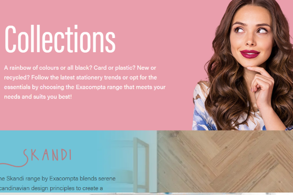
Exacompta Brands
LiveThere was an initial brief for a carbon copy of the brands page on Exacompta’s website. I felt this could be improved, so proposed moving away from this idea and to have the 5 top brands Staples sells and then the other brands in the style of exacomptas page. I provided a mockup and this got approved and the file site was loved by marketing and Exacompta themselves, I incorporated lottie animation to bring more life to the page.
- HTML + CSS
- Lottie
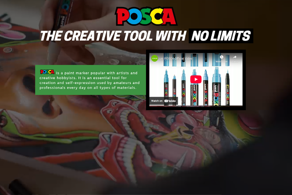
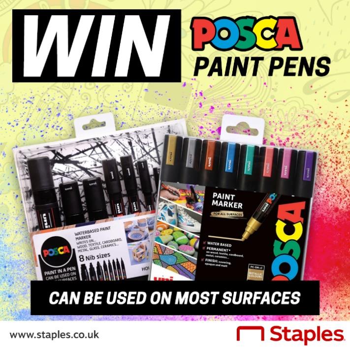
POSCA
LiveThis is another brief where I added some creative flair, the original brief was more text based and plain. I reformatted the pen selector into a more interactive experience and added the background video to compliment POSCA’s big and bold styling.
- HTML + CSS
- Javascript
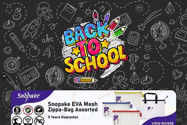
Back to School 2023
This was a Quarterly campaign that I oversaw, from initial mockup, to the creation of the landing page and associated mailers, banners and social media promos.
The logo was produced by another designer in the team, however I animated the logo in after effects and imported this via lottie. The rest of the page was more supplier led with each logo changing the content in the section below with three highlighted products.
- HTML + CSS
- Javascript
- Lottie
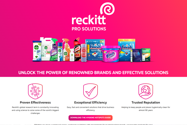
Reckitt Brands
LiveThis was a brief were it was requested to provide a mockup based off of content only, this was submitted to the supplier with only minor changes. It has been agreed that the 6 promo banners will be moved into a dual carousel to free up space and to make it less repetitive.
- HTML + CSS
- Lottie
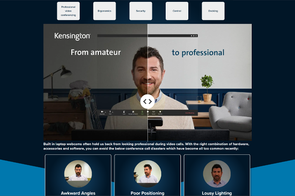
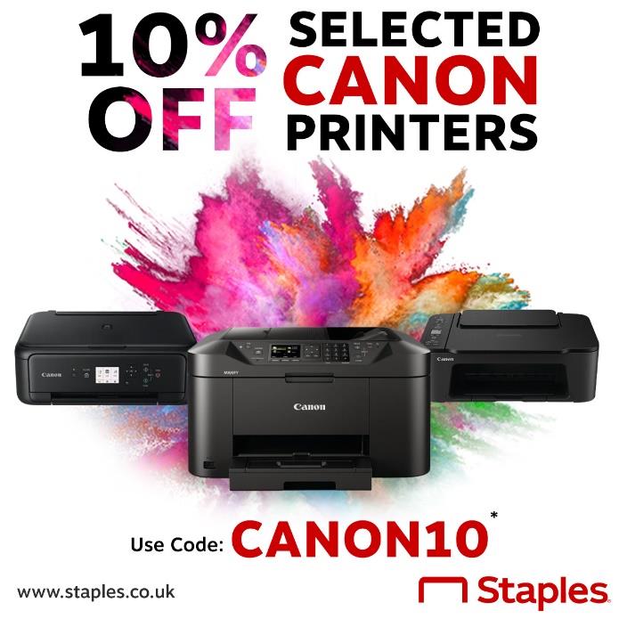
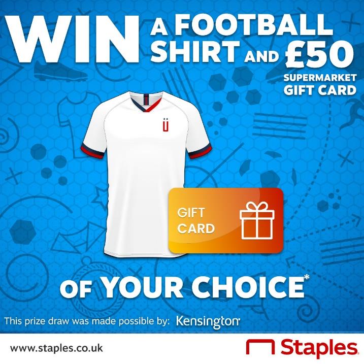
Kensington Microsite
LiveThis was briefed in as a 6 page microsite for Kensington, an initial overall landing page and then a page for each product range. Each page was required to follow Kensington's branding whilst keeping the Staples customer experience. On the video conferencing category, a slider was created to show the quality difference between an interegrated webcam and the kensington's webcam.
- HTML + CSS
- Javascript
Banners & Social Posts
CV
If you'd like to know more about my professional background and skills, feel free to download my CV.